Enterprise Product · Multi-Role Workflows · Design System -Digital Ecosystem
Hamdan Awards
Designing a scalable digital ecosystem for award applications, evaluation, and management.
- Role
- Lead Product Designer
- Timeline
- 6 months
- Platform
- Web
- Year
- 2024
- Sector
- Government · Education · Digital Platform
- Collaborator
- Ashraqat Maher — UI/UX Designer
Case study · Overview
One awards experience, three connected products
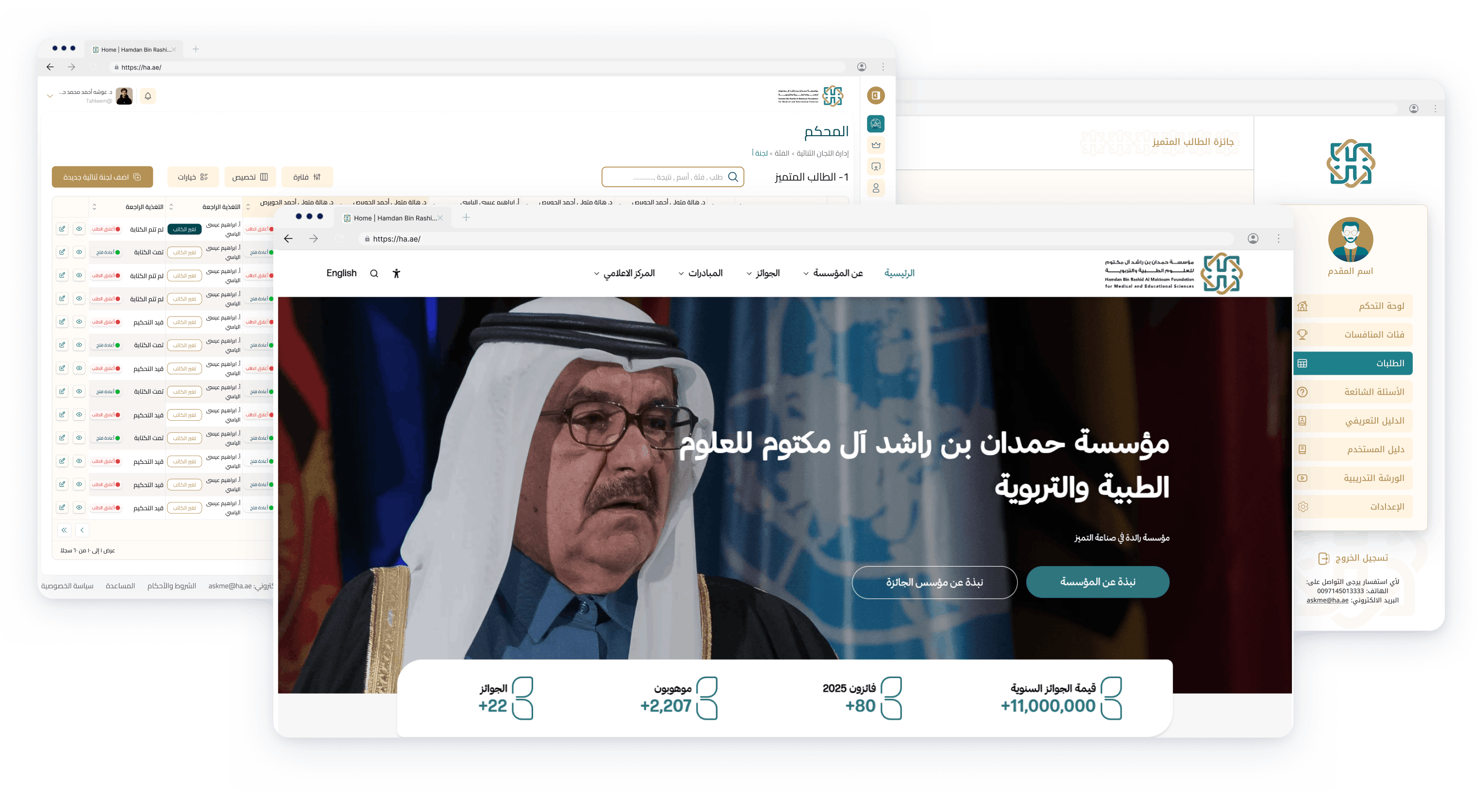
The Hamdan Awards ecosystem supports more than 5,000 applicants, judges, committees, and administrators. The work connected three products: a public foundation website, an applicant portal, and an internal awards management platform.
The core objective was to make a complex, multi-stage awards process easier to understand and operate without reducing the flexibility required by different award categories, user roles, evaluation stages, and languages.
Core objective and scope
This was not a visual refresh of one interface. It was a product-design engagement across the end-to-end service: how people discover an award, understand whether it fits, prepare an application, submit evidence, follow progress, review entries, coordinate evaluators, and communicate an outcome.
My role covered product framing, experience strategy, information architecture, user flows, interaction design, high-fidelity UI, prototyping, validation, design-system direction, and design-to-development handoff. I worked with Ashraqat Maher on UI/UX design and collaborated closely with stakeholders and engineering throughout delivery.
- Applicant experience: organize discovery, eligibility, submission, evidence, status, and support into a guided journey.
- Operational experience: clarify responsibilities and actions across administrators, committees, team leads, and judges.
- Public experience: connect institutional content and award information to a clear application path.
- System foundation: establish reusable bilingual patterns that could scale across products and future award cycles.
01 · Challenge
Making complexity understandable
The existing experience was fragmented across discovery, application, review, and administration. Applicants needed clearer guidance, while internal teams needed a dependable way to coordinate a process shaped by many roles and rules.
Fragmented applicant journey
Eligibility, requirements, evidence, progress, and outcomes were difficult to understand as one continuous journey. The product needed to help applicants know what to do now and what would happen next.
Operational complexity
Applications move between administrators, committees, team leads, and judges. Each role requires different information, permissions, actions, and visibility at different stages.
Different levels of digital familiarity
The interface had to serve occasional applicants as confidently as frequent operational users. Clarity, error prevention, and contextual guidance were therefore product requirements, not visual polish.
Scale without rigidity
The foundation needed patterns that could support multiple award cycles and categories while remaining coherent across Arabic and English experiences.
02 · Research
Evidence before interface decisions
We began by studying the existing platform and reviewing available analytics over roughly five days. This helped identify where users were leaving, which pages carried the most decision-making weight, and where the product needed deeper qualitative context.
Interviews with stakeholders and representative users then clarified the responsibilities, dependencies, and recurring points of confusion across the awards lifecycle. The findings were translated into journeys and priority workflows before moving into concepts and prototypes.

- UnderstandExisting platform and analytics
- ListenStakeholder and user interviews
- FrameJourneys, roles, and critical flows
- ExploreConcepts and prototypes
- ValidateTesting and iteration
- MeasurePost-launch performance
Principles that guided the work
What the evidence changed
The research shifted the conversation away from adding more features and toward reducing the effort required to understand the process. The highest-value opportunities were not isolated interface improvements; they were the transitions between stages, the visibility of status, and the clarity of ownership.
- Applicants needed to see requirements before committing effort, then retain a clear sense of progress throughout a long submission.
- Operational users needed the product to reflect their real responsibilities instead of presenting one universal administration model.
- High-density work could not simply be made minimal. It needed hierarchy, filtering, persistent context, and predictable actions.
- Arabic and English affected layout, reading order, labels, and data presentation, so both directions had to be considered from the beginning.
We used concepts and prototypes to test these structural decisions before investing in detailed UI. Validation focused on whether participants could understand where they were, what information they needed, and what action would move the process forward. Findings were fed back into flows, language, and component behavior before development.
03 · Ecosystem
A connected journey, not isolated screens
The solution organized the experience around three connected products. Each product serves a distinct moment, but they share one journey from awareness to application, evaluation, and outcome.
Foundation website
Discover the foundation, awards, eligibility, and official information.
Applicant portal
Choose a category, prepare evidence, submit, and track progress.
Awards management
Coordinate applications, committees, judging, and decisions.
- DiscoverFind the relevant award and understand its requirements.
- Check eligibilityConfirm the opportunity is a good fit before starting.
- ApplyComplete the guided form and provide supporting evidence.
- ReviewVerify that the submission is complete and ready.
- EvaluateAssess the application against the defined criteria.
- DecideFinalize results through the appropriate committees.
- NotifyCommunicate the outcome and relevant next steps.
04 · Applicant Portal
Turning a demanding application into a guided process
The applicant portal had to communicate complex requirements without overwhelming users. The redesigned structure moves from award discovery and eligibility into a clear application sequence, making requirements, progress, and outstanding work visible.
Application experience
Long requirements were divided into manageable steps. Contextual guidance appears where decisions are made, validation happens early, and evidence requirements are explained before upload. This reduces uncertainty and helps applicants prepare complete submissions.
Applicant dashboard
The dashboard became the applicant’s source of truth: active awards, deadlines, current status, and the next useful action are visible without searching across pages.
Selected product decisions
- Expose award categories and their distinctions early so applicants can make a confident choice before starting.
- Place eligibility confirmation at the beginning of the flow to prevent avoidable effort and incomplete submissions.
- Turn requirements into a staged checklist with visible completion rather than one long, undifferentiated form.
- Explain evidence formats and limits beside upload actions, with clear progress and validation feedback.
- Keep help and guidance connected to the current task instead of sending applicants away to search documentation.
Applicant outcome
After launch, submission performance increased by 1,352%. A satisfaction survey collected 257 responses and recorded more than 80% CSAT. These measures indicate that the redesigned experience helped more people move through the process successfully and with greater confidence.
Applicant Portal
05 · Awards Management
Supporting every role without exposing everything
The internal platform coordinates a high-volume process across administrators, committee managers, team leads, and judges. Instead of forcing every user through the same interface, navigation, actions, and information are shaped by responsibility and stage.
Administrators
Configure cycles, categories, access, and operational oversight.
Committees
Organize assignments, monitor progress, and resolve exceptions.
Team leads
Coordinate reviewers and maintain evaluation readiness.
Judges
Review evidence, apply criteria, and complete evaluations confidently.
Key design decisions
- Role-based navigation keeps the interface relevant while protecting access boundaries.
- Persistent status and clear next actions reduce reliance on memory and external coordination.
- Filters, saved context, and dense-but-readable tables support repeated operational work.
- Evaluation criteria are grouped and sequenced to help judges focus without losing context.
Designing for operational scale
The management platform had to support repeated work across award cycles while keeping the state of each application understandable. The solution treated status as a shared language across tables, detail views, assignments, evaluations, and committee work.
For administrators, the priority was oversight and configuration. For committee managers and team leads, it was coordination: knowing which applications were ready, who was responsible, and where attention was needed. For judges, the priority was focused evaluation with enough context to make a decision without carrying the full complexity of the operational system.
Evaluation experience
Evaluation was structured around a predictable sequence: identify the assigned application, understand its context, review submitted evidence, apply the relevant criteria, save progress, and complete the decision. The interface preserved context between these steps so judges did not have to reconstruct their place after every action.
Testing with 20 users produced an 82% task-success rate. In a focused benchmark, six of eight participants completed their tasks within the target time. Post-launch reporting also recorded a 21% reduction in bounce rate and approximately 71% average scroll depth.
Awards Management
06 · Design System
Consistency across products, roles, and languages
A shared design system aligned the public website, applicant portal, and awards management product. Reusable foundations and patterns made the experience more coherent and gave design and engineering a common language.
The system was organized around the behavior shared across products rather than attempting to make every screen look identical. Forms, tables, status, filters, uploads, navigation, feedback, and empty states could be reused while still adapting to a public page, a guided applicant task, or a dense operational workspace.
- Shared typography, spacing, color, elevation, and interaction states.
- Reusable form, table, filter, status, upload, navigation, and feedback patterns.
- Variants for different product contexts without fragmenting the core system.
- Documentation and handoff guidance to support implementation consistency.
RTL and LTR by design
Arabic and English were treated as equal product experiences. Direction, alignment, icon behavior, data density, and component composition were reviewed in both reading directions rather than mirrored at the end.
This approach also improved handoff. Shared names, states, and variants made it easier for design and engineering to discuss behavior, identify missing cases, and keep implementation consistent as the three products evolved.
07 · Website
Connecting public information to action
The foundation website was an important part of the ecosystem, not a separate marketing surface. Its role was to explain the foundation and its awards, improve content discovery, and create a clear path from understanding an opportunity to beginning an application.
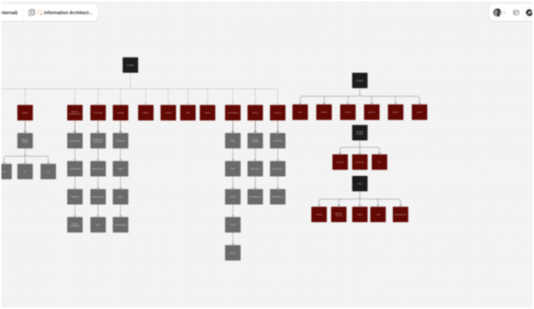
Information architecture and page hierarchy were refined so that visitors could move from broad institutional content to award-specific details, requirements, and application access with less ambiguity.
The public experience also established a more consistent bridge into the applicant portal. Calls to action were placed after the information needed to make a decision, so applying felt like the next step in the same journey rather than an abrupt jump into another system.
Website
TL;DR · Solution
Three focused changes created one coherent system
Analytics, interviews, workflow mapping, prototyping, and validation helped prioritize the moments where clarity mattered most. The result connected public discovery, guided applications, and role-based evaluation through shared patterns.
- Guide applicantsBreak complex requirements into visible steps with contextual guidance, validation, and progress.
- Support operational rolesGive administrators, committees, team leads, and judges the information and actions appropriate to each responsibility.
- Scale the ecosystemUse a shared bilingual design system across the website, applicant portal, and management platform.
08 · Outcomes
Measured improvement across both sides of the journey
The strongest signal was not a single screen—it was a clearer journey for applicants and a more structured operating model for the teams managing the awards.
Metrics reflect approved project reporting. No private analytics or applicant data are shown.
What changed
For applicants, the experience became more explicit about requirements, progress, evidence, and next actions. This reduced the cognitive load of translating a complex awards policy into a complete digital submission.
For operational teams, the product better reflected how responsibility moves between roles. Status, assignment, filtering, and evaluation patterns created a more consistent way to coordinate work without exposing every control to every user.
For the product organization, the shared system reduced fragmentation across the website, applicant portal, and management platform. It provided a foundation for future cycles while making design and development decisions easier to align.
09 · Takeaways
Clarity is an ecosystem decision
Complex enterprise products become easier when the team designs around responsibilities, decisions, and transitions—not around a collection of pages. Making status, ownership, and next actions visible reduced friction for both occasional and expert users.
The project also reinforced the value of treating bilingual behavior and system patterns as foundational decisions. They made the three products feel connected while giving each one enough flexibility for its purpose.
What I would carry forward
- Map transitions between roles as carefully as the tasks inside each role; many enterprise failures happen at the handoff.
- Use progressive guidance to simplify complex rules without hiding information people need to make confident decisions.
- Preserve density where expert work demands it, but introduce clear hierarchy and persistent context.
- Treat localization as product behavior and test both directions throughout design and implementation.
- Measure both sides of a service. Applicant success and operational success are connected, but they need different evidence.